This is a basic 'To do list'. I am going to do this in sequel to produce my final pieces.
My Logo-
My Logo-
I have designed a logo to go on my magazine, I looked at other magazines like Q Mag, and have been inspired by that, as we are both following the same kind of genre. I have used a bight red background because this is common in a lot of magazine, and stands out, the writing is done in white also to stand out. The 'T' in 'top' can be seen as a tall pole, I done this so it looks like a ladder, as if the artists are reaching for the top.
My Images-
Front page
These are the images that I have taken for my front page, I have used close shots as this is what I think will look best for the cover page, as you can see all the facial features. This will make it look more appealing. Also, these are the main shot types that I have seen in Qmag and various other magazines. I am going to Photoshop these images when I start my cover page to cut the background out so that it is plain white. I am also going to put some effects/filters on them to make them look more appealing, and to make them brighter, as they are a bit dark.
I have analysed all my images that I have taken from the above. This is the image I believe is the best photo for my cover page, this is because the lighting is good in the image, also because I think the pose is good and looks constructed, like the ones on the professional magazines. I like the guitar in the image, as it is an ident that it is a music magazine. The fact that the guitar is red suits the magazine well because my logo is red too, also she is wearing bright red lipstick too. This means that all the colours are co-ordinating well together.
Double-page spread
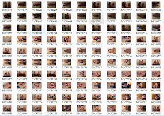
These are the images that I took for my double page spread, I used various camera shots, as I wanted to get a mix, as they all have different purposes.
Two friends and I planned this photo shoot on Facebook.
I have analysed all the images to find my main photo for my double page spread. I wanted my main image to be a close us as it gives the feeling that it is more personal. Then I was going to do a few smaller polaroid images to go on the page, for these I was going to use a few types of shots, to make it more fun! Here are the ones that I have come up with..
I chose this image to be my main feature picture, i am going to crop it so that it becomes a bigger, mid-shot, so we get a bigger scene of direct mode of address. I chose this image because I think it looks posed and she is looking directly at the camera, making it seem more like a personal connection between her and the reader. When I make the edits on Photoshop, I am going to out a filter on it, to make it brighter.
I chose this image for the Polaroid images because it looks fun and something that teenage girls would do (surface realism). I think the lighting is good in this, and their facial emotions are clear that they are having fun.
I chose this image as well, because it looks like something teenagers would do, with the pose and the way they are holding their bodies. In this image, they are reflecting the story of being being innocent, they look like average everyday teenagers.
Lastly I chose this one because they are pulling funny faces, making the shoot look fun and exciting, they are jumping on each others back.
Contents Page
I have done this photo shoot with my sister for my contents page.
I have analysed through these pictures and found the best one for the content page. I chose this image because you can see her face well, and its a direct mode of address. She is slightly posing with her mouth, something that a lot of celebrities do in photo shoots.
Mock Layouts-
I have done some mock layouts, this is so that I have seen and chosen where exactly I want each part of my magazine. This will help me construct my magazine. I have also researched the page measurements of a magazine, so that when I start my production I have the correct measurements on Photoshop.
Front page
I have chosen to go with the first layout as I think this one has the most benefits, for example I would prefer the logo to be on the left side third, as people will recognize this when it is on the shelves. Also, I think the name will stand out more on a blank background, rather than being on the image itself. The image itself I haven't changed in either layout, this is because all the magazines I have looked at they are the main focus, therefore I need it to be very big and central to the page. I can overlay my text onto the image, as I have seen this done on other magazines, along as it does not cover an important part of the image, like her eyes, or other facial features.
Fonts
For my cover page I need bold writing that will stand out, it needs to be professional looking, as it is representing the whole magazine, not just my article for my double page spread. I am going to have a look on Dafont.com to see the kinds of fonts they have that I can use.
I like these fonts as they are professional looking, bold and professional. These fonts will be good to use for the cover page of my magazine.
Double page spread
I like the first and second layout, they are both very simple and give a good ratio on image and text, although I think that they are a bit too simple, also I think this is the style a lot of other magazines use, and I would like something a bit different and more exciting.
The 4th one I like as it is symmetrical, and has a good image and text ratio, I think this is more exciting than the 1st and 2nd one, the only issue with this one is that when it gets folded in the middle, it is going to go through her face, this could make it look less appealing.
I think that when I make my double page spread, I am going to use a style like the 3rd one, this is because there is space for a few images, this means that there will be more on the page for people to see, making it more exciting, they are in a more fun position, with a quote or reference at the side. Then the main article on the other page. This is just a plan though, when it comes to it, I may change things around, to make things look the best they can, I think this is a trial and error process that cannot be planed too much ahead.
Fonts
On my double page spread I wanted to have some personalised writing, this is so it looks like she has actually written on the article, to make it seem like their is a relationship between her and the reader. I am going to experiment with some fonts that look like handwriting styles, to see which ones look the best
These are the kinds of writing that I would like to have in my double page spread. I like them because they look like real handwriting, therefore has the personalised element in it.
My Article-
I have pre-written my article, so when it comes to putting the information into the double page spread I have it ready. My article is going to go with my images and its going to be about the musician, I am going to have a brief overview of her life, and 'about her', which is then going to follow an interview. I am going to have a blog link, where readers can send in their questions, where they get a personal reply. There are also going to be other external links and articles on the page, that do not relate to the musician.


No comments:
Post a Comment